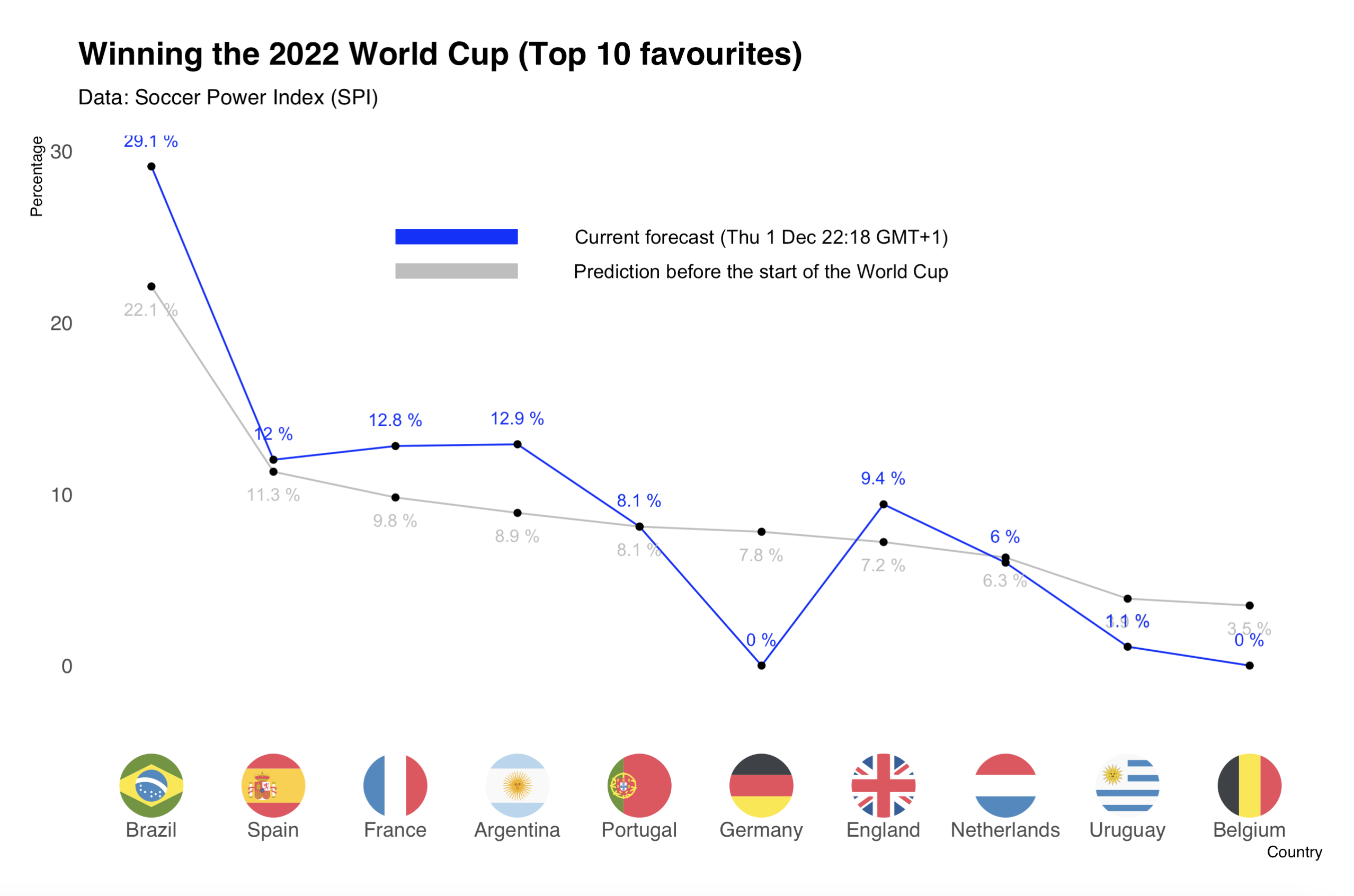
Winning the 2022 World Cup (Top 10 favourites)

code
analysis
Author

FV

Published

December 1, 2022

Winning the 2022 World Cup

- The grey line shows the predictions before the start of the World Cup.

- The blue line shows the current predictions.

# LIB
{
library(readxl)
library(ggplot2)
library(dplyr)
library(ggflags)
library(stringr)
library(hrbrthemes)
}

# DATA
cup <- read.csv("cup.csv", sep=";", stringsAsFactors = FALSE)
cup <- cup[with(cup, order(-cup$WIN.WORLD.CUP)), ] 

# ORDER
cup$TEAM <- gsub("\n","",cup$TEAM)
cup$TEAM <- gsub(" ","",cup$TEAM)
cup$TEAM <- str_replace_all(cup$TEAM," ", "")  
cup$TEAM
 [1] "Brazil"      "Spain"       "France"      "Argentina"   "Portugal"   
 [6] "Germany"     "England"     "Netherlands" "Uruguay"     "Belgium"    
[11] "Denmark"     "Croatia"     "Switzerland" "USA"         "Mexico"     
[16] "Senegal"     "Ecuador"     "Morocco"     "Serbia"      "Japan"      
[21] "Canada"      "Poland"      "SouthKorea"  "Tunisia"     "Iran"       
[26] "Wales"       "Cameroon"    "SaudiArabia" "Australia"   "Qatar"      
[31] "Ghana"       "CostaRica"  
cup <- head(cup,10)
names(cup)[12] = "Win"


new <- c(29.10, 12.00, 12.80, 
         12.90, 8.10, 0, 
         9.40, 6.00, 1.10, 0)

cup2 <- cbind(cup, new)

#PLOT

plot <- ggplot(data=cup2, aes(x= reorder(TEAM, -Win) , y=Win, group=1)) +
  ggtitle("Winning the 2022 World Cup (Top 10 favourites)") +
  xlab("Country") +
  ylab("Percentage") +
  
  geom_line(col="gray") +
  geom_point() +
  
  geom_line(data=cup2, aes(x= reorder(TEAM, -new) , y=new, group=1),  col="blue") +
  geom_point(data=cup2, aes(x= reorder(TEAM, -new) , y=new, group=1)) +
  
  geom_text(data=cup2,aes(label=paste(Win, "%") ), vjust=2.3, color="gray", size=3.5)+
  geom_text(data=cup2, 
            aes(x= reorder(TEAM, -new) , y=new, size=18),
            label=paste(new, "%"), vjust=-1.6, color="blue", size=3.5)+
  geom_flag(data=cup2, aes(x = reorder(TEAM, -Win) , y=-7, country = code), size=15) +
  theme_ipsum(grid = F, base_family = "sans") +
  labs(subtitle = "Data: Soccer Power Index (SPI)") +
  
  geom_segment(aes(x="France",
                   xend = "Argentina", 
                   y = 25,
                   yend = 25),
               size = 4, 
               col = "blue") +
  
  geom_segment(aes(x="France",
                   xend = "Argentina", 
                   y = 23,
                   yend = 23),
               size = 4,
               col = "gray") +
  
  annotate("text", x = "Germany", y = 23, label = "Prediction before the start of the World Cup") +
  annotate("text", x = "Germany", y = 25, label = "Current forecast (Thu 1 Dec 22:18 GMT+1)")

# plot