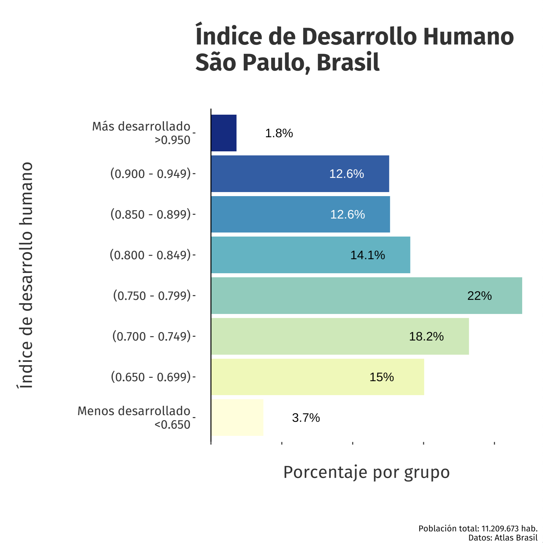
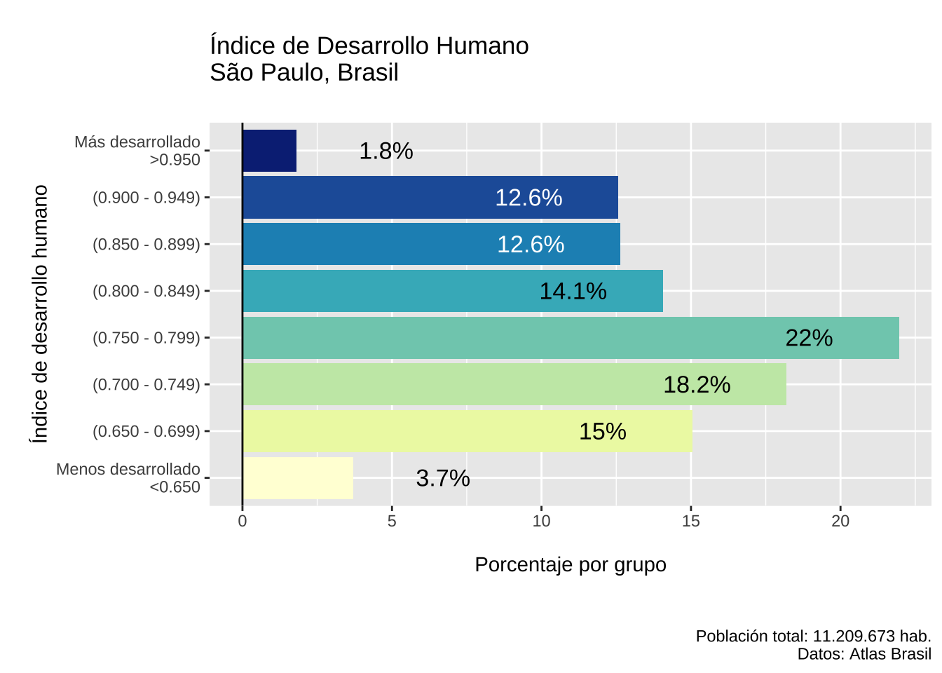
Los datos representan el Índice de Desarrollo Humano en los diferentes distritos del Municipio de São Paulo en el 2010.
Code
# LIBRARIES
{
library(ggplot2)
library(ggthemes)
library(dplyr)
library(readr)
library(sf)
library(showtext)
}

# FONTS
font_add_google("Luckiest Guy","ramp")
font_add_google("Bebas Neue","beb")
font_add_google("Fira Sans","fira")
font_add_google("Raleway","ral")
font_add_google("Bitter","bit")
showtext_auto()

# DATA
data <- readr::read_rds(
  "https://github.com/viniciusoike/restateinsight/raw/main/static/data/atlas_sp_hdi.rds"
)

HDI <- data |>
  st_drop_geometry() |>
  mutate(
    group_hdi = findInterval(HDI, seq(0.65, 0.95, 0.05), left.open = FALSE),
    group_hdi = factor(group_hdi)) |>
  group_by(group_hdi) |>
  summarise(score = sum(pop, na.rm = TRUE)) |>
  ungroup() |>
  mutate(share = score / sum(score) * 100) |>
  na.omit()
Code
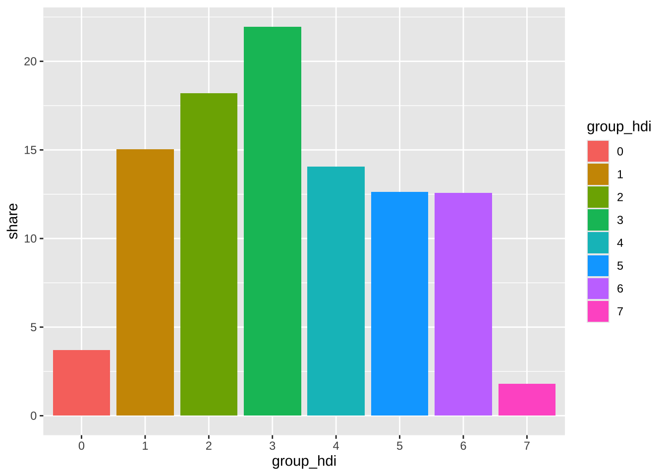
ggplot(HDI, aes(group_hdi, share, fill = group_hdi)) +
  geom_col()
Code
HDI <- HDI |>
  mutate(
    y_text = if_else(group_hdi %in% c(0, 7), share + 3, share - 3),
    label = paste0(round(share, 1), "%")
  )
Code
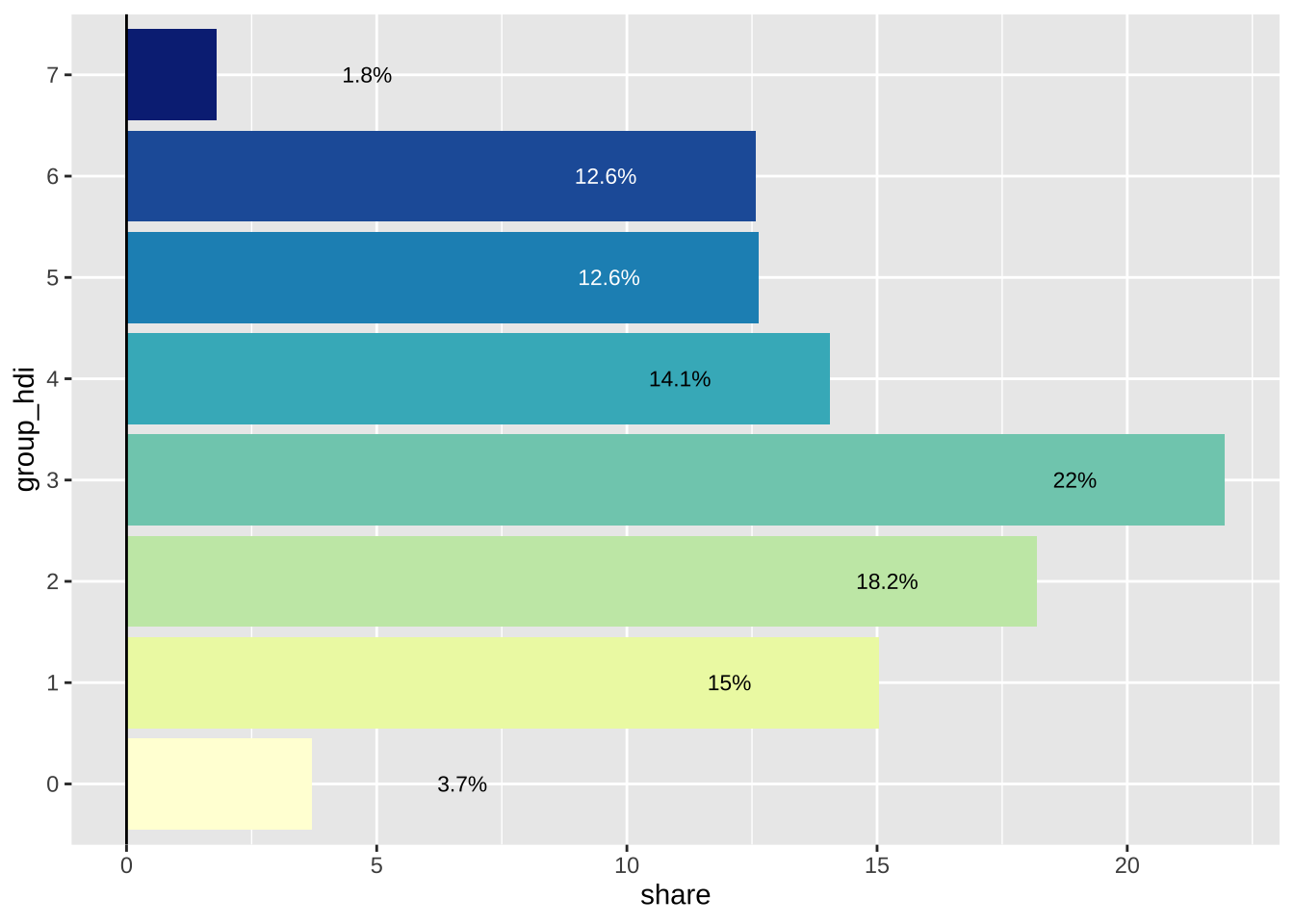
ggplot(HDI, aes(group_hdi, share, fill = group_hdi)) +
  geom_col() +
  geom_hline(yintercept = 0) +
  geom_text(
    aes(y = y_text, label = label, color = group_hdi),
    size = 3
  ) +
  coord_flip() +
  scale_fill_brewer(palette = "YlGnBu") +
  scale_color_manual(values = c(rep("black", 5), rep("white", 2), "black")) +
  guides(fill = "none", color = "none")
Code
x_labels <- c(
  "Menos desarrollado\n<0.650", "(0.650 - 0.699)", "(0.700 - 0.749)", "(0.750 - 0.799)",
  "(0.800 - 0.849)", "(0.850 - 0.899)", "(0.900 - 0.949)", "Más desarrollado\n>0.950"
)
Code
 ggplot(HDI, aes(group_hdi, share, fill = group_hdi)) +
  geom_col() +
  geom_hline(yintercept = 0) +
  geom_text(
    aes(y = y_text, label = label, color = group_hdi),
    size = 4.5
  ) +
  coord_flip() +
  scale_x_discrete(labels = x_labels) +
  scale_fill_brewer(palette = "YlGnBu") +
  scale_color_manual(values = c(rep("black", 5),
                                rep("white", 2),
                                "black")) +
  guides(fill = "none", color = "none") +
   labs(
     title = "\nÍndice de Desarrollo Humano\nSão Paulo, Brasil\n",
     caption = "Población total: 11.209.673 hab.\nDatos: Atlas Brasil",
     x = "\nÍndice de desarrollo humano",
     y = "\nPorcentaje por grupo\n\n")
Code
plot <- ggplot(HDI, aes(group_hdi, share, fill = group_hdi)) +
   geom_col() +
   geom_hline(yintercept = 0) +
   geom_text(
     aes(y = y_text, label = label, color = group_hdi),
     size = 4.5
   ) +
   coord_flip() +
   scale_x_discrete(labels = x_labels) +
   scale_fill_brewer(palette = "YlGnBu") +
   scale_color_manual(values = c(rep("black", 5),
                                 rep("white", 2),
                                 "black")) +
   guides(fill = "none", color = "none") +
   labs(
     title = "\nÍndice de Desarrollo Humano\nSão Paulo, Brasil\n",
     caption = "Población total: 11.209.673 hab.\nDatos: Atlas Brasil",
     x = "\nÍndice de desarrollo humano",
     y = "\nPorcentaje por grupo\n\n") +
  theme(
    text = element_text(family = "fira"),
    panel.grid = element_blank(),
    plot.title = element_text(size = 25, colour = "gray20", face="bold"),
    axis.text.y = element_text(size = 13, colour = "gray20"),
    axis.title.x = element_text(size = 18, colour = "gray20"),
    axis.title.y = element_text(size = 18, colour = "gray20"),
    axis.text.x = element_blank(),
    panel.background = element_rect(fill = 'white', color = 'white')
  )

#plot