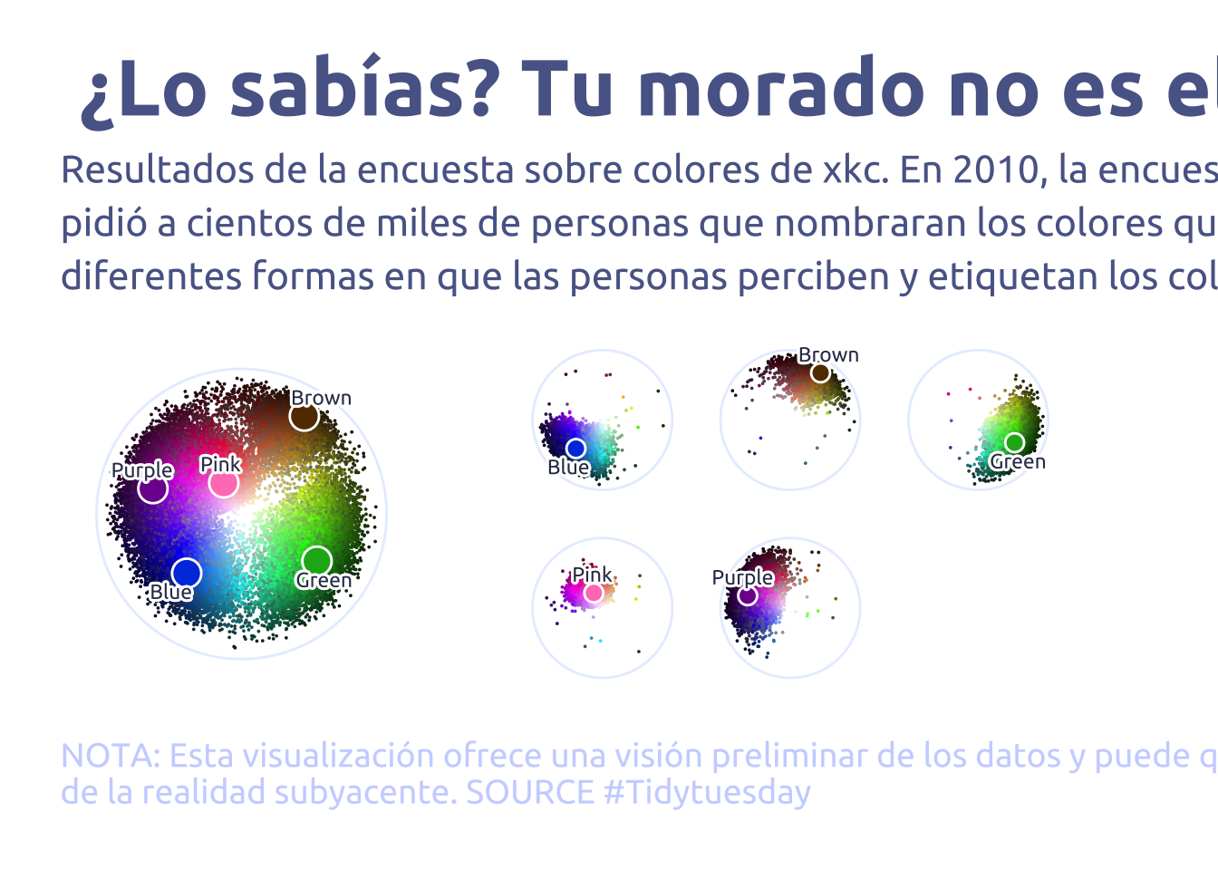
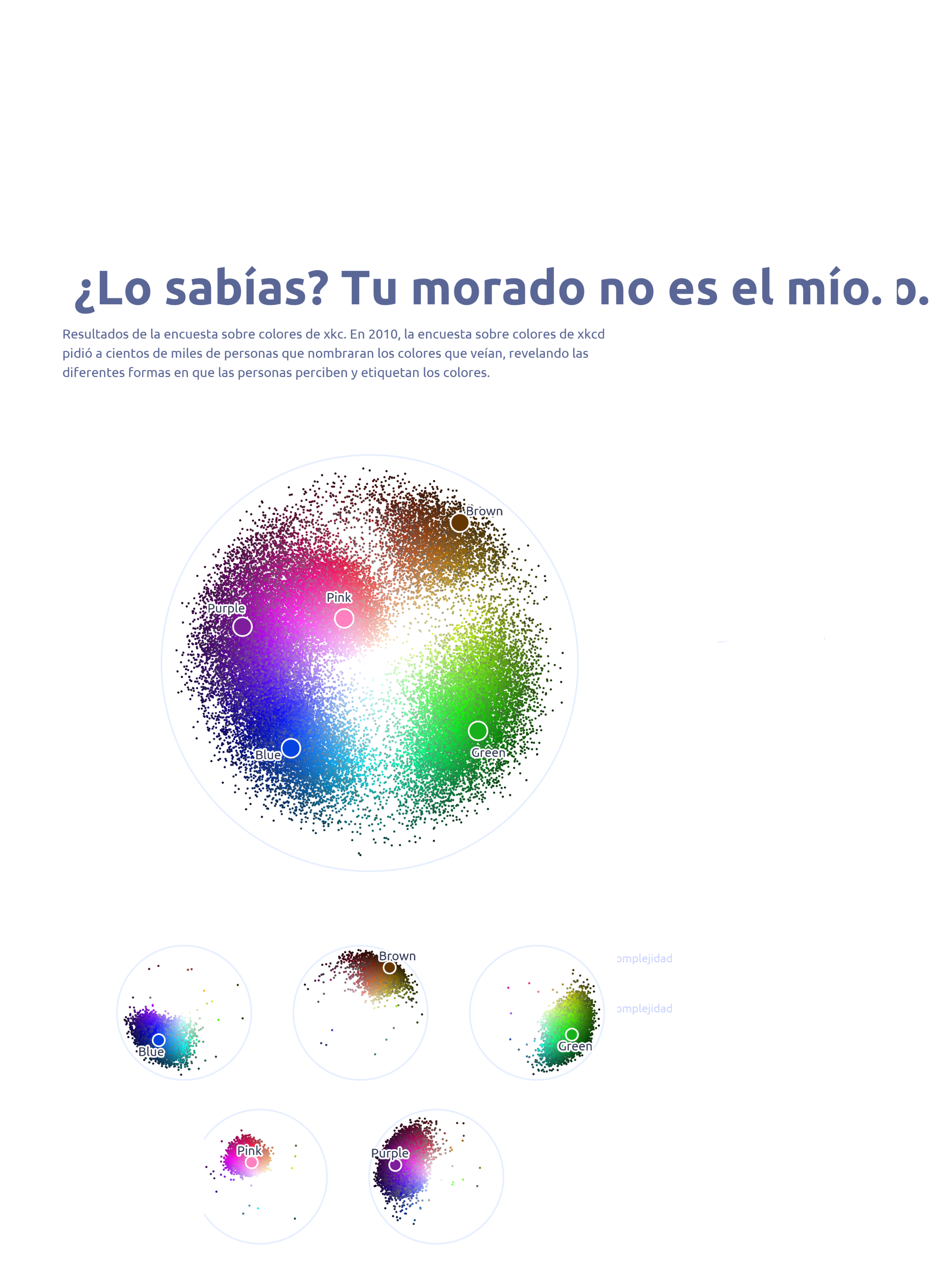
library (tidyverse)library (glue)library (scales)library (showtext)library (ggtext)library (shadowtext)library (maps)library (ggpattern)library (ggrepel)library (patchwork)font_add_google ("Ubuntu" , "Ubuntu" , regular.wt = 400 , bold.wt = 700 )showtext_auto ()showtext_opts (dpi = 300 )<- "#323955" <- "#5a6695" <- "#7e89bb" <- "#a4aee2" <- "#cbd5ff" <- "#e7efff" <- "#A31C44" <- "#F01B5B" <- "#F43E75" <- "#E891AB" <- "#FAC3D3" <- "#FCE0E8" theme_set (theme_minimal () + theme (# axis.line.x.bottom = element_line(color = '#474747', linewidth = .3), # axis.ticks.x= element_line(color = '#474747', linewidth = .3), # axis.line.y.left = element_line(color = '#474747', linewidth = .3), # axis.ticks.y= element_line(color = '#474747', linewidth = .3), # # panel.grid = element_line(linewidth = .3, color = 'grey90'), panel.grid.major = element_blank (),panel.grid.minor = element_blank (),axis.ticks.length = unit (- 0.15 , "cm" ),plot.background = element_blank (),plot.title.position = "plot" ,plot.title = element_text (family = "Ubuntu" , size = 33 , face = 'bold' ),plot.caption = element_text (size = 14 ,color = cool_gray4,margin = margin (20 , 0 , 0 , 0 ),hjust = 0 plot.subtitle = element_text (size = 16 ,lineheight = 1.15 ,margin = margin (5 , 0 , 15 , 0 )axis.title.x = element_markdown (family = "Ubuntu" ,hjust = .5 ,size = 8 ,color = cool_gray1axis.title.y = element_markdown (family = "Ubuntu" ,hjust = .5 ,size = 8 ,color = cool_gray1axis.text = element_text (family = "Ubuntu" ,hjust = .5 ,size = 9 ,color = cool_gray1legend.position = "top" ,text = element_text (family = "Ubuntu" , color = cool_gray1),plot.margin = margin (25 , 25 , 25 , 25 )<- readr:: read_csv ('https://raw.githubusercontent.com/rfordatascience/tidytuesday/main/data/2025/2025-07-08/answers.csv' )<- readr:: read_csv ('https://raw.githubusercontent.com/rfordatascience/tidytuesday/main/data/2025/2025-07-08/color_ranks.csv' )<- readr:: read_csv ('https://raw.githubusercontent.com/rfordatascience/tidytuesday/main/data/2025/2025-07-08/users.csv' )|> count (user_id, sort = TRUE , name = "answers" ) |> count (answers, sort = TRUE )library (plotwidgets)<- |> filter (user_id %in% (users |> filter (spam_prob < 0.001 ) |> pull (user_id))) |> left_join (|> rename (rank_hex = hex) |> rowwise () |> mutate (hsl_rank = list (col2hsl (rank_hex))) |> ungroup (),by = 'rank' |> rowwise () |> mutate (hsl = list (col2hsl (hex))) |> ungroup ()<- |> hoist (hsl, h = 1 , s = 2 , l = 3 ) |> hoist (hsl_rank, h_rank = 1 , s_rank = 2 , l_rank = 3 )<- |> rowwise () |> mutate (hsl_rank = list (col2hsl (hex))) |> ungroup () |> hoist (hsl_rank, h = 1 , s = 2 , l = 3 ) |> filter (rank %in% data2plot$ rank)# Main <- |> left_join (users, by = 'user_id' ) |> filter (colorblind == 0 ) |> filter (spam_prob < 0.001 ) |> ggplot (aes (x = h, y = - l)) + annotate (geom = 'segment' , x = 0 , xend = Inf , y = 0 , color = cool_gray5) + geom_point (aes (color = hex), size = 0.001 ) + geom_point (data = data2plot2, aes (color = 'white' ), size = 5.5 ) + geom_point (data = data2plot2, aes (color = hex), size = 4.5 ) + geom_text_repel (data = data2plot2,aes (label = str_to_sentence (color)),family = "Ubuntu" ,color = cool_gray0,size = 3 ,nudge_x = 5 ,nudge_y = .1 ,direction = "y" ,hjust = "center" ,bg.color = 'white' ,segment.size = 0 ,bg.r = 0.2 + scale_color_identity () + scale_y_continuous (limits = c (- 1 , 0 )) + coord_polar () + labs (title = " ¿Lo sabías? Tu morado no es el mío." ,subtitle = str_wrap ("Resultados de la encuesta sobre colores de xkc. \n En 2010, la encuesta sobre colores de xkcd pidió a cientos de miles de personas que nombraran los colores que veían, revelando las diferentes formas en que las personas perciben y etiquetan los colores." ,width = 90 pattern_spacing = NULL ,y = NULL ,x = NULL ,caption = str_wrap ("NOTA: Esta visualización ofrece una visión preliminar de los datos y puede que no refleje toda la complejidad de la realidad subyacente. SOURCE #Tidytuesday" ,width = 110 ,|> str_replace_all ("@" , " \n " )+ theme (axis.text.x = element_blank (),axis.text.y = element_blank (),axis.title.x = element_blank (),axis.title.y = element_blank (),plot.margin = margin (0 , 0 , 0 , 0 )# Faceted (copied only because of laziness) <- data2plot |> left_join (users, by = 'user_id' ) |> filter (colorblind == 0 ) |> filter (spam_prob < 0.001 ) |> ggplot (aes (x = h, y = - l)) + annotate (geom = 'segment' , x = 0 , xend = Inf , y = 0 , color = cool_gray5) + geom_point (aes (color = hex), size = 0.001 ) + geom_point (data = data2plot2, aes (color = 'white' ), size = 3.5 ) + geom_point (data = data2plot2, aes (color = hex), size = 2.5 ) + geom_text_repel (data = data2plot2,aes (label = str_to_sentence (color)),family = "Ubuntu" ,color = cool_gray0,size = 3 ,nudge_x = 5 ,nudge_y = .1 ,direction = "y" ,hjust = "center" ,bg.color = 'white' ,segment.size = 0 ,bg.r = 0.2 + scale_color_identity () + scale_y_continuous (limits = c (- 1 , 0 )) + coord_polar () + facet_wrap (~ color, nrow = 2 ) + theme (axis.text.x = element_blank (),axis.text.y = element_blank (),axis.title.x = element_blank (),axis.title.y = element_blank (),strip.text = element_blank (),plot.margin = margin (0 , 0 , 0 , 0 )# Plot both + p2