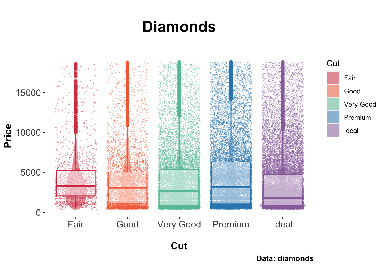
library ("ggplot2" )data (diamonds)ggplot (data = diamonds, aes (x = cut, y = price)) + scale_fill_manual (values = c ("#d53e4f" ,"#f46d43" , "#66c2a5" , "#3288bd" , "#9970ab" )) + scale_color_manual (values = c ("#d53e4f" , "#f46d43" ,"#66c2a5" , "#3288bd" ,"#9970ab" )) + geom_jitter (aes (color = cut), size = .01 , alpha = 0.4 , show.legend = FALSE ) + geom_violin (aes (fill = cut), alpha = 0.5 , color = NA ) + geom_boxplot (aes (color = cut), alpha = 0.5 , show.legend = FALSE ) + xlab (" \n Cut" ) + ylab ("Price" ) + labs (title= " \n Diamonds" , subtitle = "" , caption = "Data: diamonds \n " , fill= "Cut" ) + theme (axis.text.x = element_text (size = 12 ),axis.text.y = element_text (size = 12 ),axis.title.x = element_text (size = 13 , face= "bold" ),axis.title.y = element_text (size = 13 , face= "bold" ),panel.spacing = unit (0 , "pt" ),panel.border = element_blank (),panel.grid.major.x = element_blank (),strip.background = element_blank (),strip.text = element_text (colour = "black" ),legend.justification = c ("right" , "top" ),legend.box.just = "right" ,legend.margin = margin (6 , 6 , 6 , 6 ),plot.title = element_text (size = 20 , face = "bold" , hjust = 0.5 ),plot.subtitle = element_text (size = 16 , face = "bold" , hjust = 0.5 ),plot.caption = element_text (size = 10 , face = "bold" , hjust = 1 ),panel.background = element_rect (fill= "white" , colour= "white" )