library(tidyverse)
library(showtext)
library(ggtext)
library(glue)
library(ggview)
library(ggh4x)
library(cowplot)
library(grid)
tuesdata <- tidytuesdayR::tt_load("2026-03-17")
monthly_losses_data <- tuesdata$monthly_losses_data
monthly_mortality_data <- tuesdata$monthly_mortality_data
font_add_google("Oswald")
font_add_google("Nunito")
showtext_auto()
showtext_opts(dpi = 300)
title_font <- "Oswald"
body_font <- "Nunito"
bg_col <- "#F2F4F8"
text_col <- "#151C28"
highlight_col <- "#7F055F"
region_data <- monthly_mortality_data |>
filter(geo_group %in% c("county", "country"), species == "salmon") |>
select(date, region, median, q1, q3)
end_plot_data <- region_data |>
group_by(region) |>
slice_max(date) |>
arrange(desc(median)) |>
ungroup()
plot_data <- region_data |>
mutate(
region = factor(region, levels = end_plot_data$region),
region = fct_relevel(region, "Norge", after = 0)
)
design <- "
##B
##C
##D
AAE
AAF
AAG
##H
"
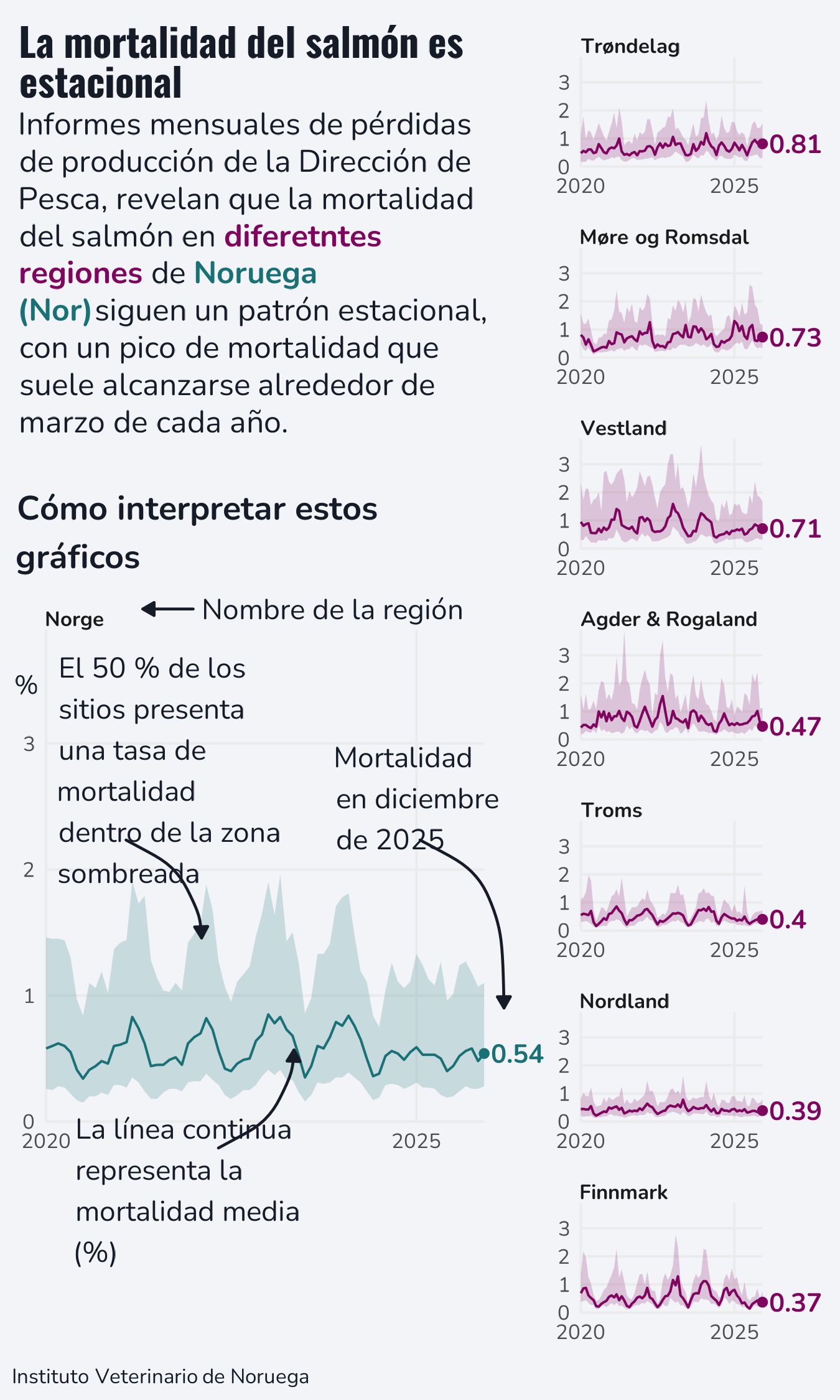
title <- glue("<span style='font-family:{title_font};font-size:15pt;'>**La mortalidad del salmón es estacional**</span><br>")
st <- glue("{title}Informes mensuales de pérdidas de producción de la Dirección de Pesca, revelan que la mortalidad del salmón en <span style='color:#7F055F;'>**diferetntes regiones**</span> de <span style='color:#197176;'>**Noruega (Nor)**</span>siguen un patrón estacional, con un pico de mortalidad que suele alcanzarse alrededor de marzo de cada año.")
cap <- c("Instituto Veterinario de Noruega")
p <- ggplot(data = plot_data) +
geom_ribbon(
mapping = aes(
x = date, ymin = q1, ymax = q3,
fill = (region == "Norge"),
),
alpha = 0.2
) +
geom_line(
mapping = aes(
x = date, y = median,
colour = (region == "Norge"),
)
) +
geom_point(
data = slice_max(plot_data, date),
mapping = aes(
x = date, y = median,
colour = (region == "Norge")
)
) +
geom_text(
data = slice_max(plot_data, date),
mapping = aes(
x = date, y = median,
colour = (region == "Norge"),
label = paste0(" ", round(median, 2))
),
hjust = 0,
family = body_font,
fontface = "bold"
) +
facet_manual(vars(region), design = design, axes = "x") +
scale_fill_manual(values = c(highlight_col, "#197176")) +
scale_colour_manual(values = c(highlight_col, "#197176")) +
scale_x_date(
date_breaks = "5 years",
date_labels = "%Y"
) +
scale_y_continuous(limits = c(0, NA)) +
labs(
x = NULL, y = "%", caption = cap,
tag = st
) +
coord_cartesian(expand = FALSE, clip = "off") +
theme_minimal(base_size = 10, base_family = body_font) +
theme(
plot.margin = margin(5, 30, 5, 5),
plot.title.position = "plot",
plot.caption.position = "plot",
legend.position = "none",
plot.background = element_rect(fill = bg_col, colour = bg_col),
panel.background = element_rect(fill = bg_col, colour = bg_col),
plot.tag.position = c(0.01, 0.99),
plot.tag = element_textbox_simple(
colour = text_col,
hjust = 0,
halign = 0,
vjust = 1,
valign = 1,
margin = margin(b = 5, t = 0),
family = body_font,
maxwidth = 0.63
),
plot.caption = element_textbox_simple(
colour = text_col,
hjust = 0,
halign = 0,
margin = margin(b = 0, t = 10),
family = body_font
),
strip.text = element_textbox_simple(
face = "bold",
margin = margin(t = 10),
size = rel(0.8)
),
axis.title.y = element_text(angle = 0,
hjust = 1,
vjust = 0.5,
margin = margin(r = -5),
colour = text_col),
panel.grid.minor = element_blank(),
panel.spacing.x = unit(2, "lines"),
panel.spacing.y = unit(1, "lines")
)
ggdraw(p) +
draw_text(
x = 0.07, y = 0.45,
size = 11,
hjust = 0,
colour = text_col,
family = body_font,
text = str_wrap("El 50 % de los sitios presenta una tasa de mortalidad dentro de la zona sombreada", 17)
) +
draw_grob(
curveGrob(
x1 = 0.15, y1 = 0.40,
x2 = 0.24, y2 = 0.33,
curvature = -0.3,
gp = gpar(col = text_col, lwd = 1.5, fill = text_col),
arrow = arrow(type = "closed", length = unit(0.07, "inches"))
)
) +
draw_text(
x = 0.09, y = 0.15,
size = 11,
hjust = 0,
colour = text_col,
family = body_font,
text = str_wrap("La línea continua representa la mortalidad media (%)", 17)
) +
draw_grob(
curveGrob(
x1 = 0.26, y1 = 0.18,
x2 = 0.35, y2 = 0.25,
curvature = 0.3,
gp = gpar(col = text_col, lwd = 1.5, fill = text_col),
arrow = arrow(type = "closed", length = unit(0.07, "inches"))
)
) +
draw_text(
x = 0.24, y = 0.565,
size = 11,
hjust = 0,
colour = text_col,
family = body_font,
text = str_wrap("Nombre de la región", 20)
) +
draw_grob(
curveGrob(
x1 = 0.23, y1 = 0.565,
x2 = 0.17, y2 = 0.565,
curvature = 0,
gp = gpar(col = text_col, lwd = 1.5, fill = text_col),
arrow = arrow(type = "closed", length = unit(0.07, "inches"))
)
) +
draw_text(
x = 0.4, y = 0.43,
size = 11,
hjust = 0,
colour = text_col,
family = body_font,
text = str_wrap("Mortalidad en diciembre de 2025", 12)
) +
draw_grob(
curveGrob(
x1 = 0.50, y1 = 0.40,
x2 = 0.60, y2 = 0.28,
curvature = -0.3,
gp = gpar(col = text_col, lwd = 1.5, fill = text_col),
arrow = arrow(type = "closed", length = unit(0.07, "inches"))
)
) +
draw_text(
x = 0.02, y = 0.62,
size = 13,
hjust = 0,
colour = text_col,
fontface = "bold",
family = body_font,
text = str_wrap("Cómo interpretar estos gráficos", 30)
) +
canvas(
width = 4.5, height = 7.5,
units = "in", bg = bg_col,
dpi = 300
) -> p